
The Brief: Design a logo for myself and brand.
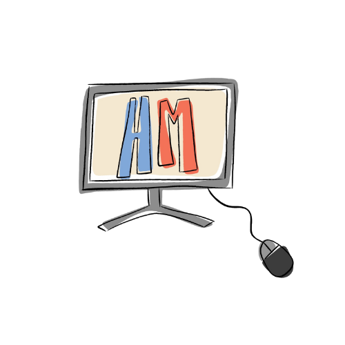
As I’m creating a logo for myself as a designer, I wanted someone to know instantly when they look at my logo, what it is that I do. This is why the main graphic in the design is a computer screen. Following this, I didn’t want my logo to look too busy so on the computer screen I put my initials so the logo is personalised.
The Brief: find areas on campus to observe and sketch using conventional sketchbooks or iPads, creating quick outlines
The first task of the semester was to sketch five different areas from around campus. I chose to sketch from the Cafe on campus, a view of Queen's flats from outside my window, The St Edburga building, The stripe and the view beyond it and lastly the west downs entrance.
I tried varying the amount of detail I added to each of these sketches, as you can Queens is very detailed with a lot of focus on the buildings similarly to the stripe whereas the drawing of west downs was much simpler with less detail.
The Brief: Design and produce a promotional flyer in which colour is explored and emphasises the information to be portrayed.
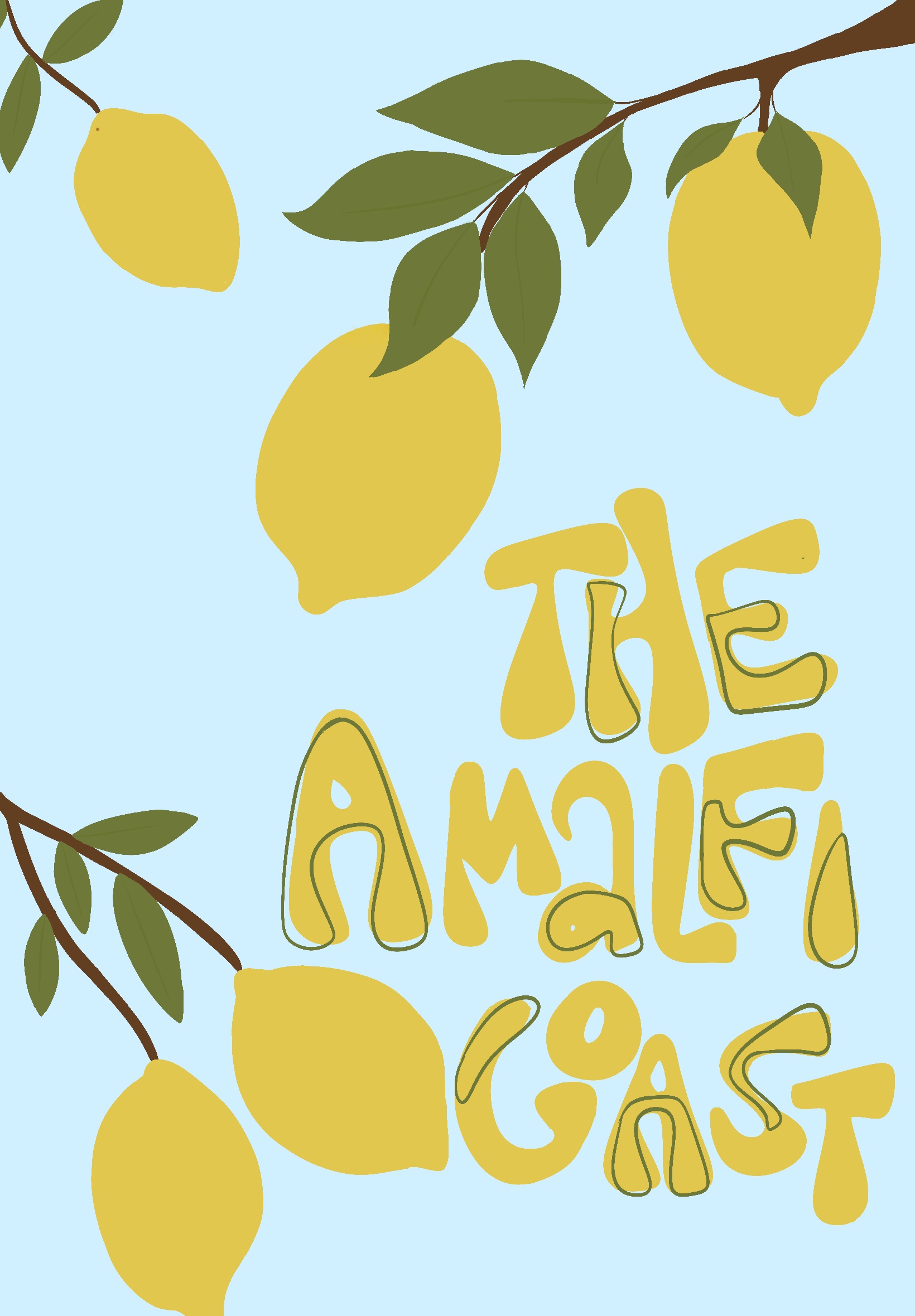
Following the brief to use colour to create a promotional flyer, I chose to base it on the Amalfi Coast. Amalfi Coast is renowned for its Lemon trees so I chose to base it around them, I used the bright yellow of the lemons as the main colour of the poster, while also keeping the background a bright blue colour to reflect the sun and bright nature of the coast. I did this to create a light and happy feel to the piece as if it was a bright sunny day in Italy. I also wanted to portray the coast as fun, exciting, and a happy place to be so I made sure the typography was round and not to rigid to keep the overall feel of the piece bright and happy.
The Breif: Design a piece of ‘digital art’ (static) based on a traditional artist e.g. William Blake, Samuel Palmer, Salvador Dali, or a modern digital designer/illustrator e.g. David Carson, Neville Brody or Vaughan Oliver.
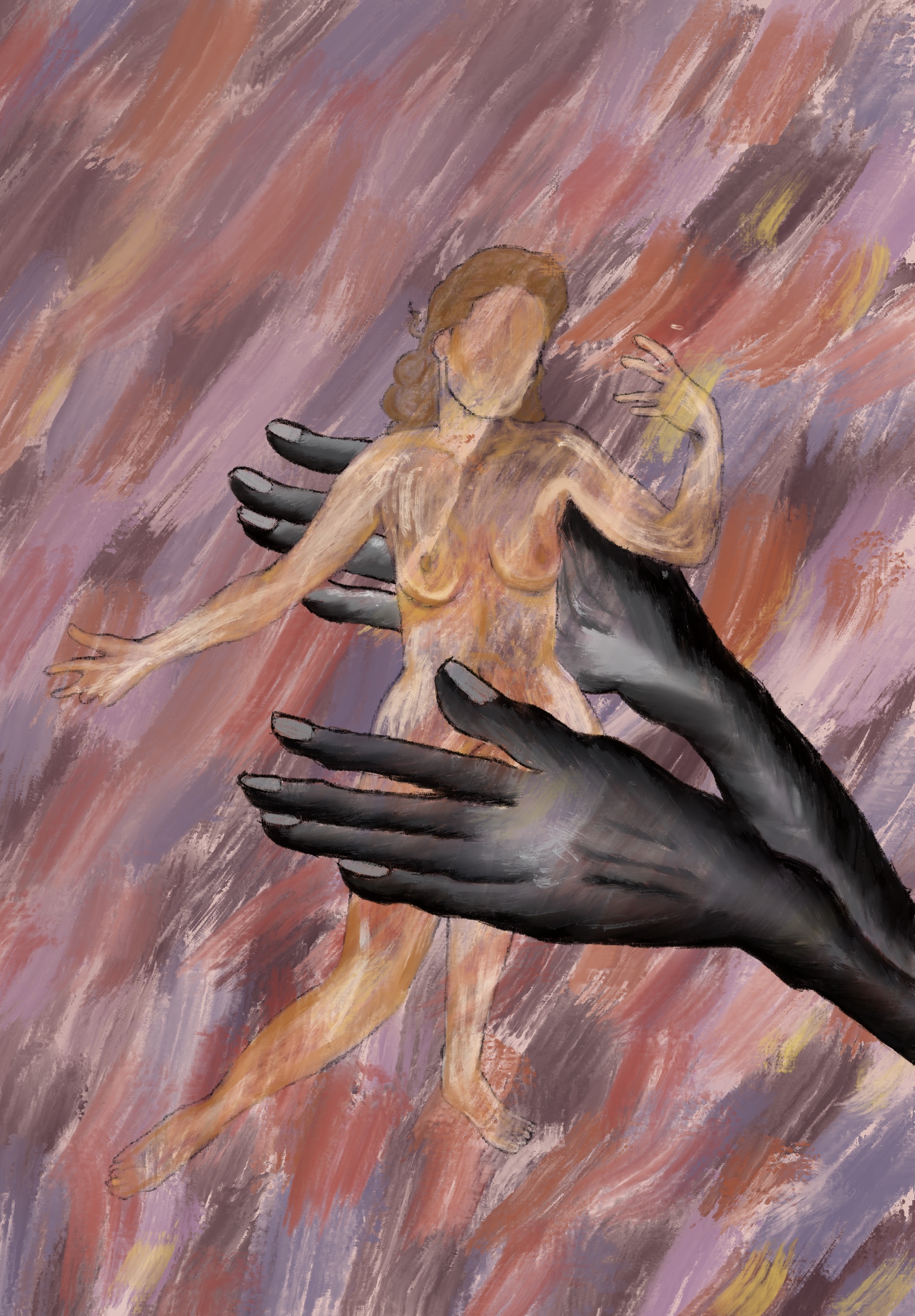
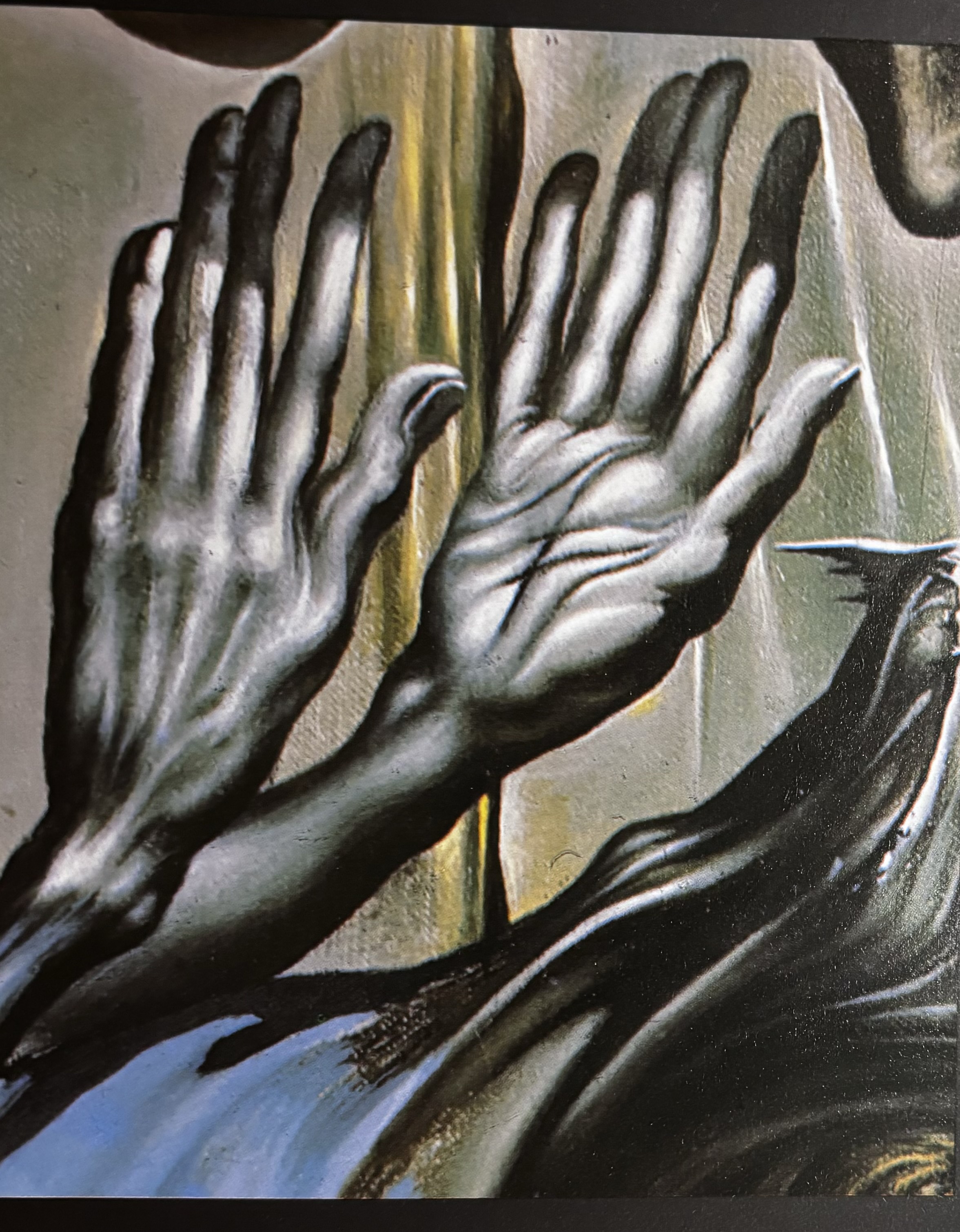
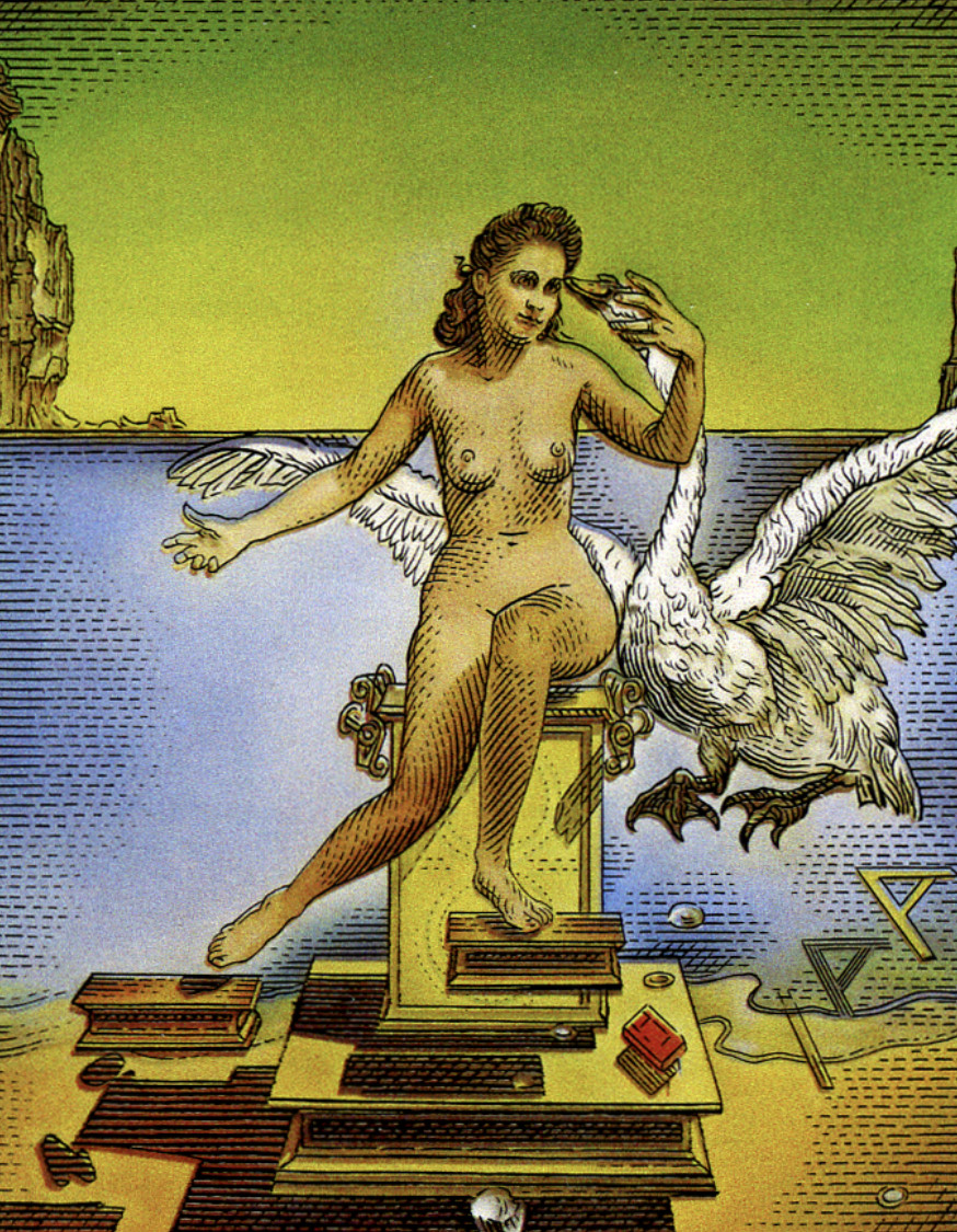
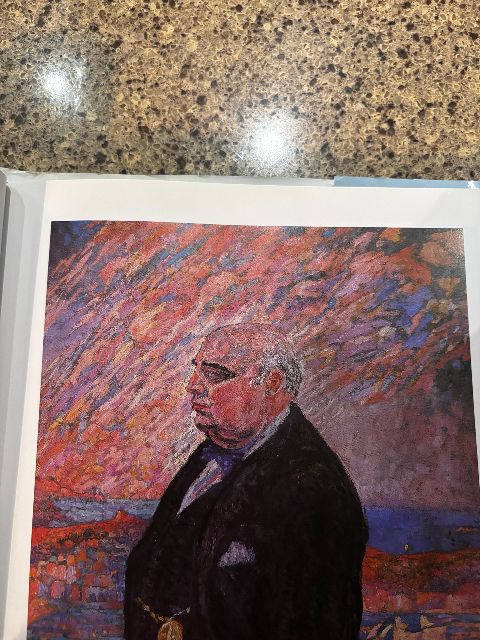
Week fours task was to create a peice of digital art based on a traditonal artis. For thie I chose Dali, As you can see on the right there is a selection of photos i took from a book, I selected some things I found really intresting from his work for example, the pair of dark hands from the Tristan and isolde painintg, the background from the portrait of his Farther; I found the colours and oil like effect extremley facinating and lastly the shiloute of the woman based on his wife. Once I had decided what I liked I combined them into one making small tweaks and adjustments until I was happy with my final peice.
The Brief: Sketch ideas for a logo that you will animate for a title sequence or channel ident. Decide on how you might animate
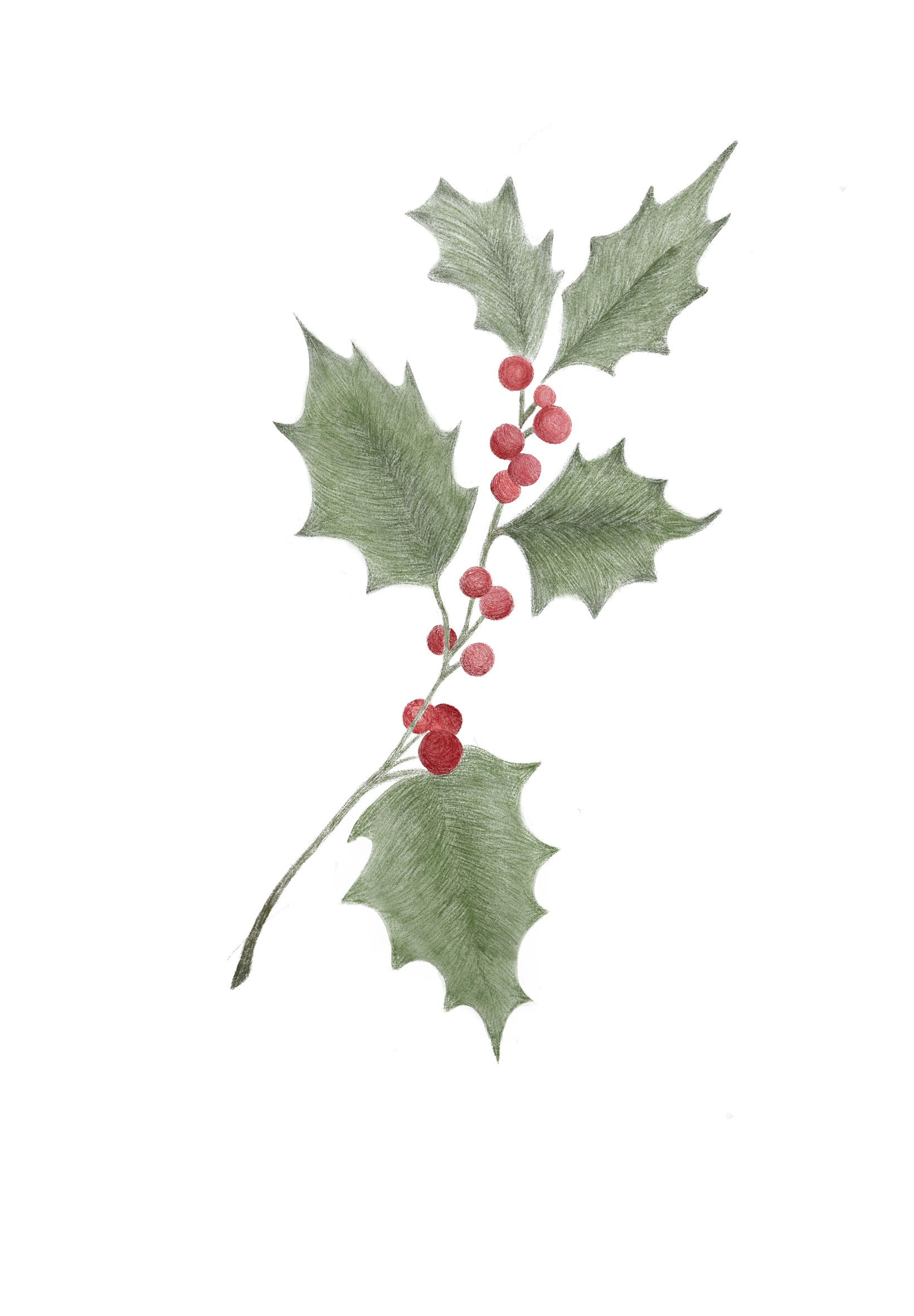
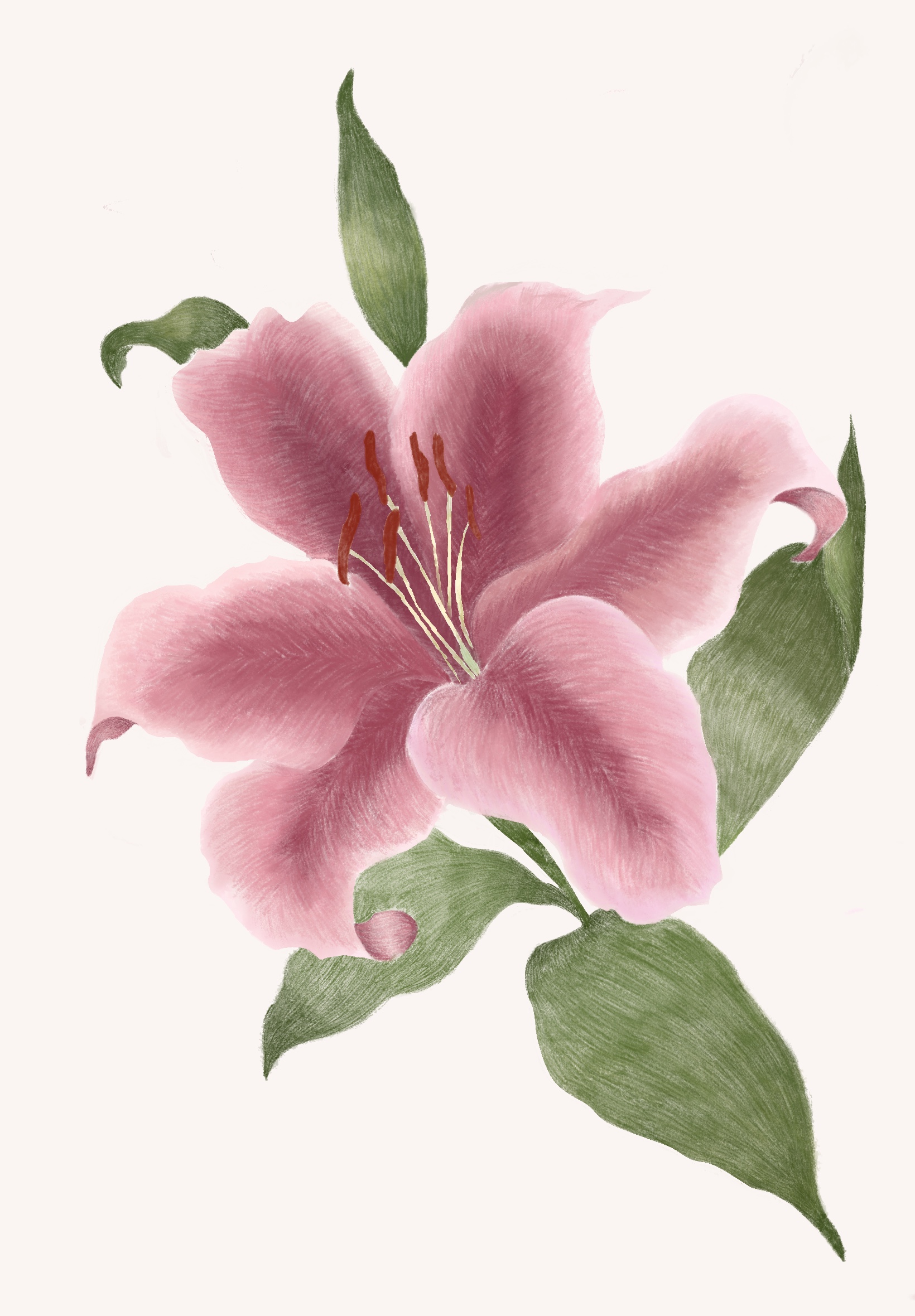
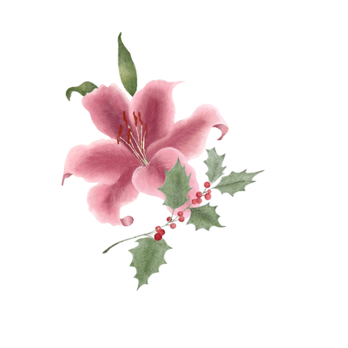
To create a logo design I used Hollie leaves and a Lillie flower, I used these because these are me and my sister's names. We've always loved the two flowers, so I designed the two to be incorporated within the logo. I wanted the logo to feel pretty and almost have a feminine feel to it keeping with the flowers, I used a Serif font to keep with the elegant theme of the logo and animation, which is under the animation tab on my homepage.
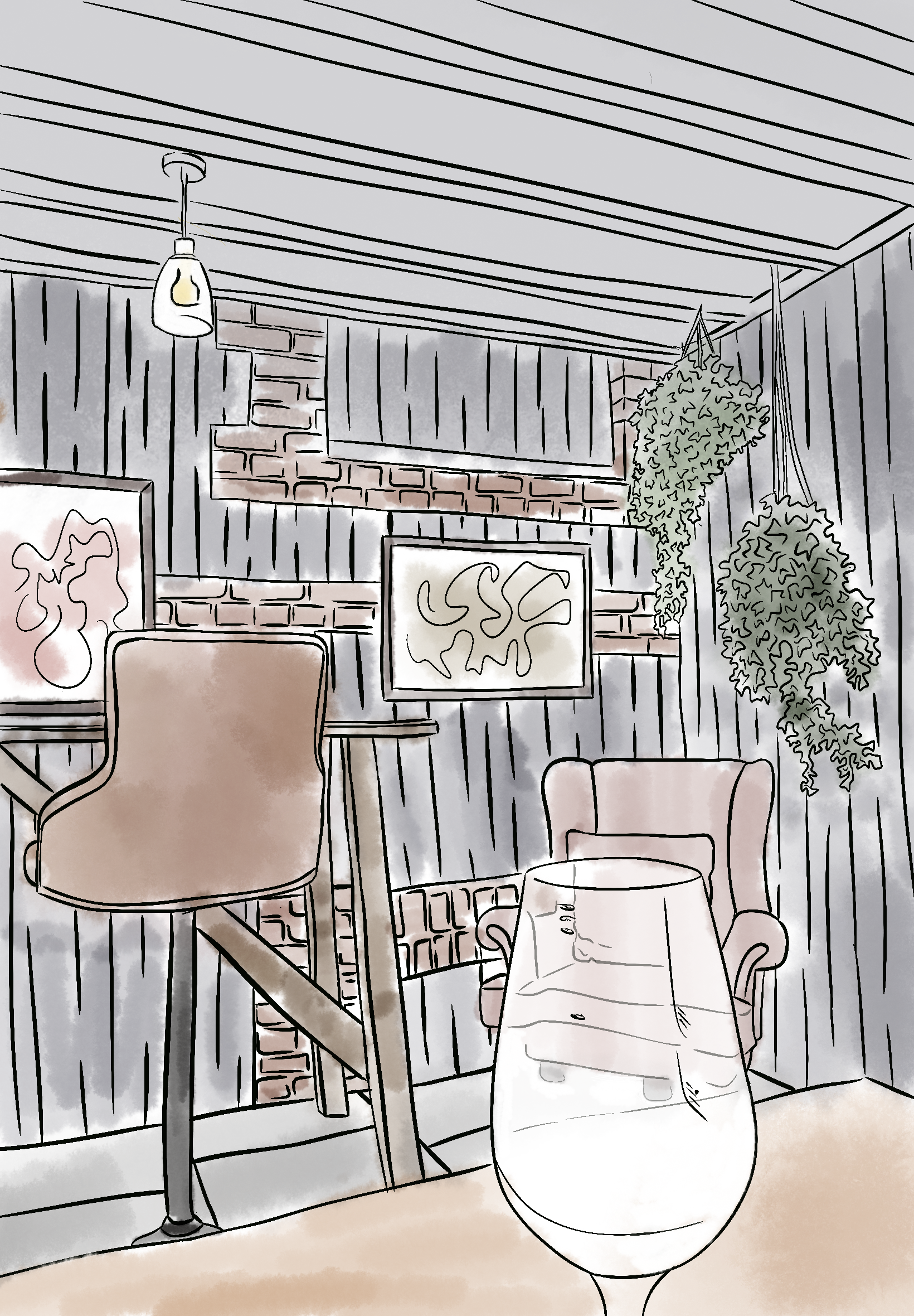
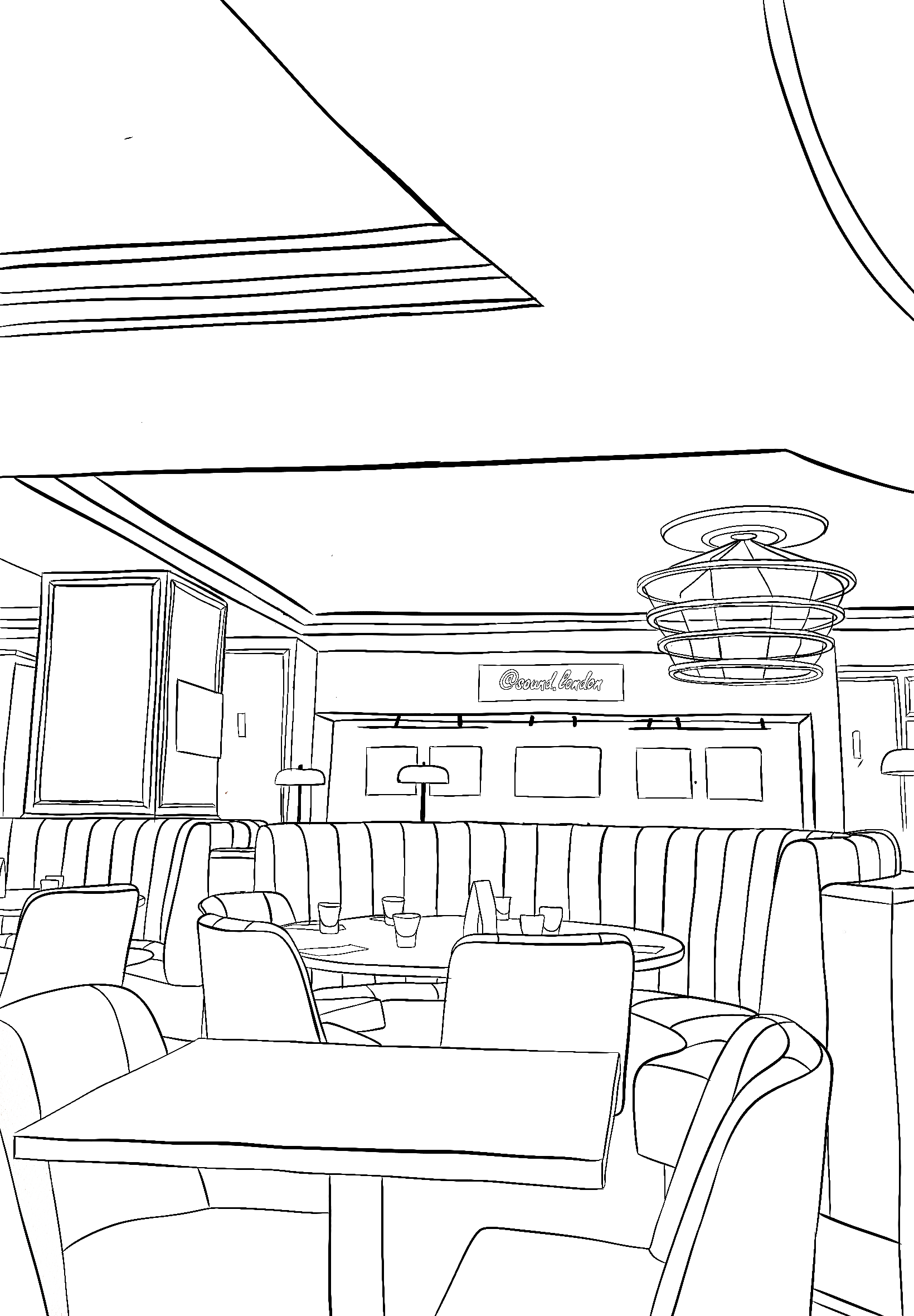
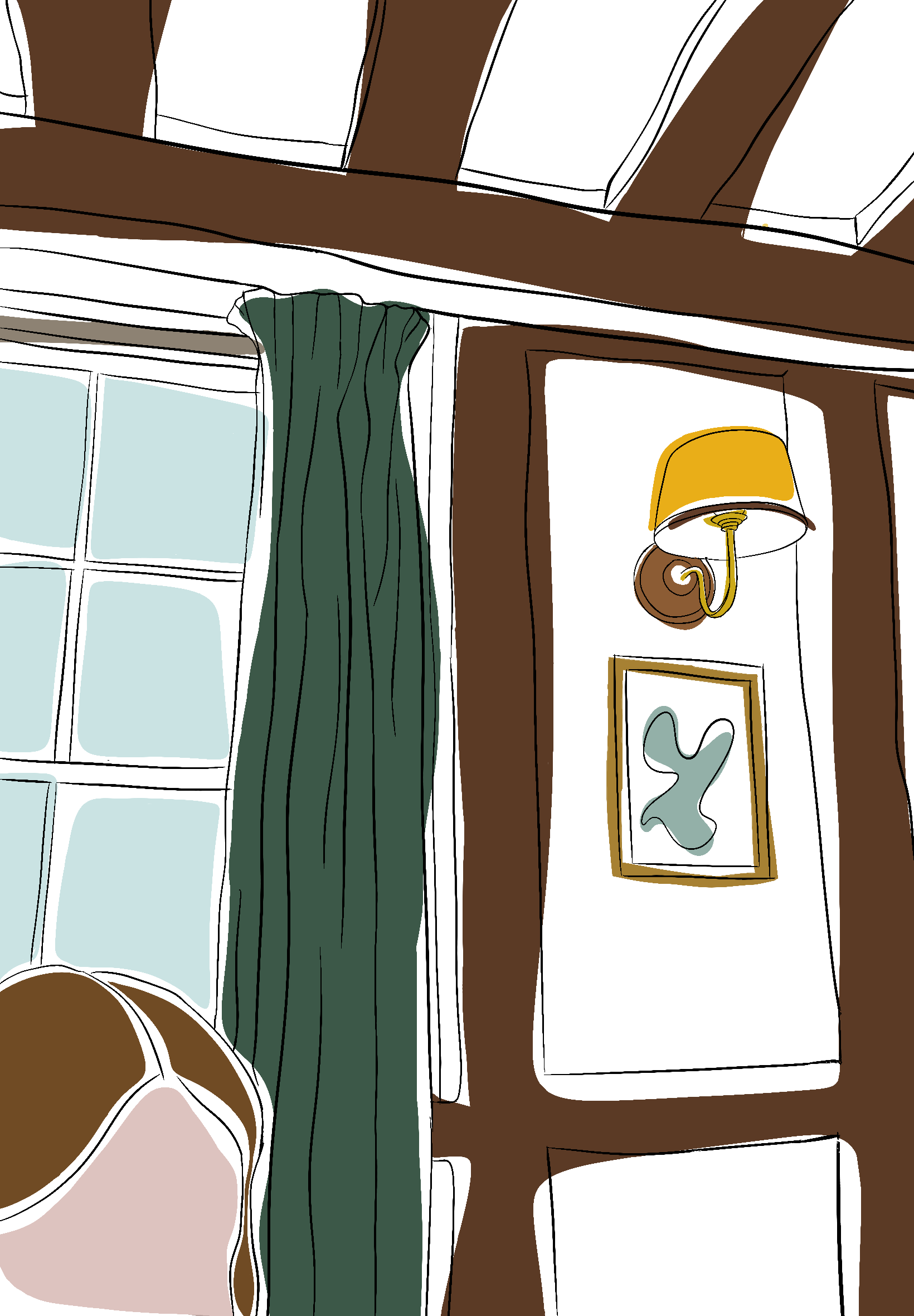
Above are three designs all sketched based on photographs I’ve taken of places I've been; all three bases of the designs are the same using black outlines however I used a different style to complete each one.
For the first design, there was quite a lot of detail in the sketch I didn’t want there to be lots of colour to take away from the black sketching and outlines, so I used a watercolour transparent effect so you could still see the outlines underneath.
For the second design, I used a lot more detail in the sketch and focused a lot more on smaller things so I decided not to use any colour in the design to show this without colour distracting or pulling away from the details.
For the last sketch, I used very simple and basic outlines so I could use colours that are bold and full to bring aspects of the design to life such as the windows and lampshades, I also didn’t keep the colour in the lines of the design to make the colour stand out more.
The Brief: Photoshop a graphic onto a stock image

I created this design in Photoshop, I used the stock image of a red hat and edited the graphic on the top to make it look realistic.